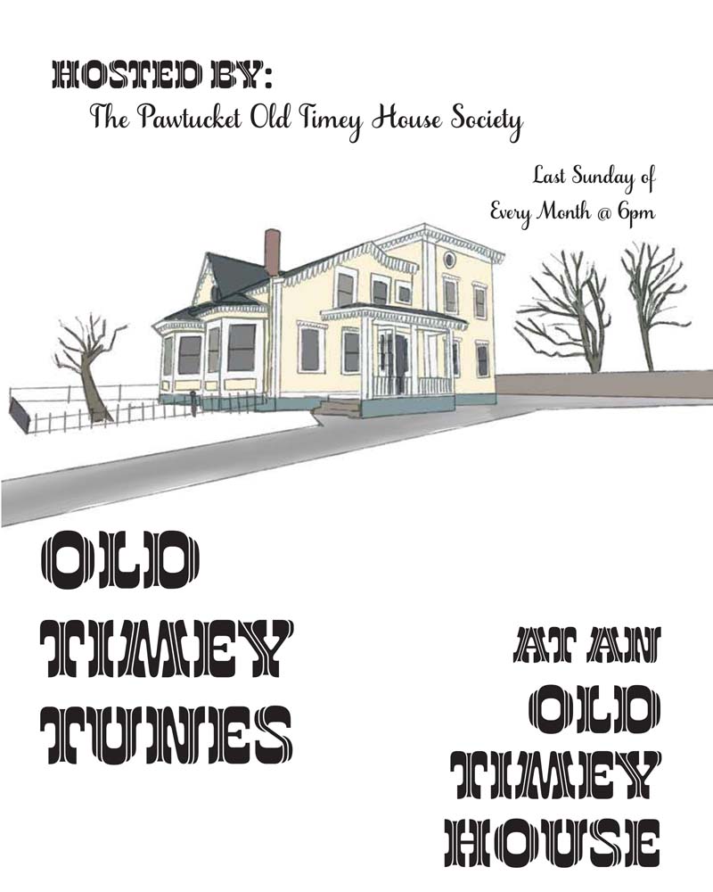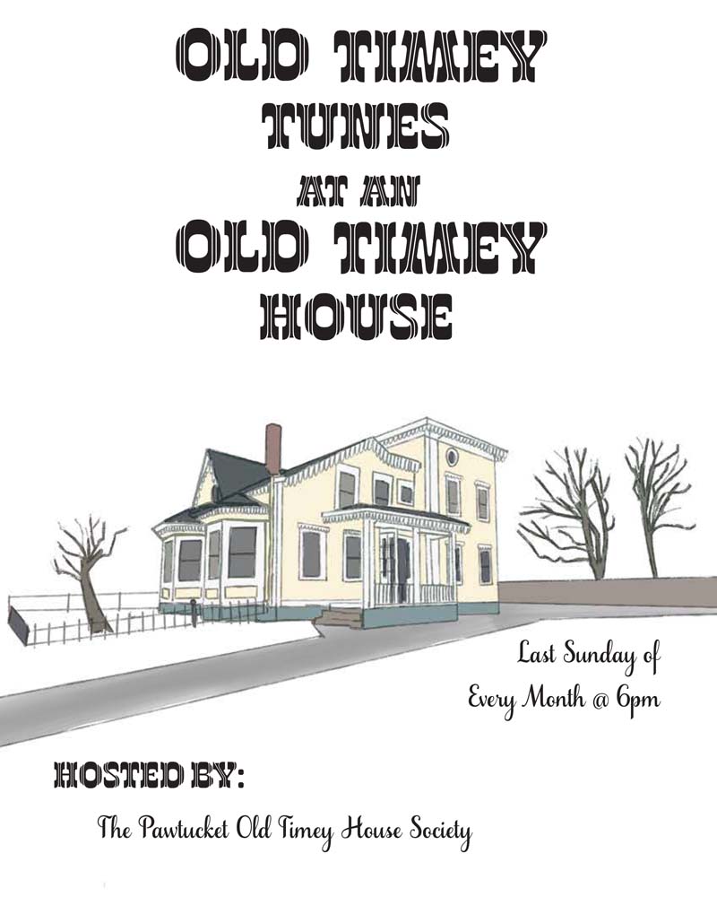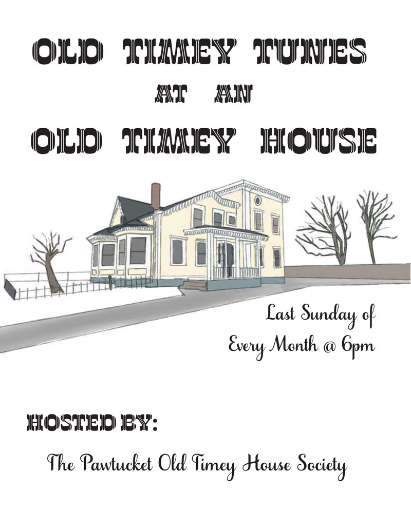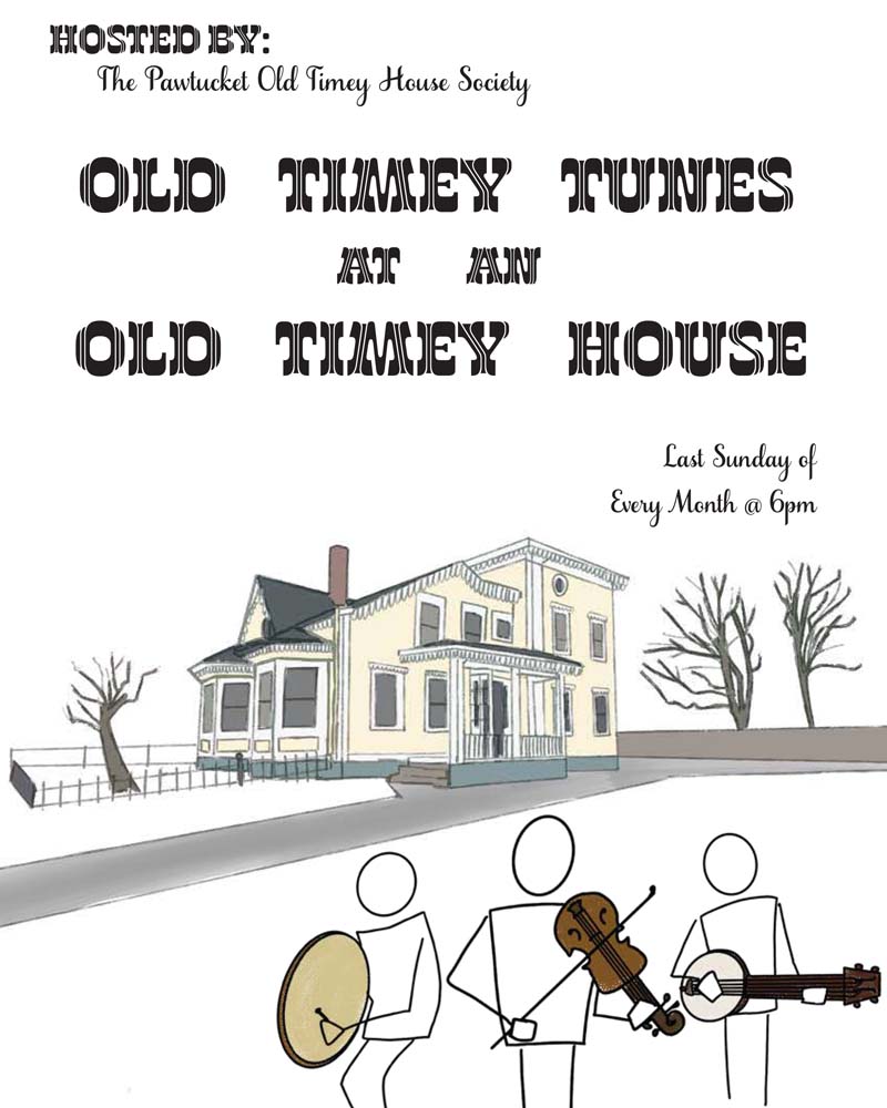
This project was very personal to me as I was tasked with illustrating the house where my great grandmother lived as I was growing up. This house has been in our family for years, hence gaining an “Old Timey” feel.
My cousin had reached out asking for me to create posters for an event he would help host at the house. There would be folk music once a month- hence the old timey vibe of the entire event.
I wanted to be able to show off the beauty of the home, without the background of Pawtucket, RI surrounding it. My great grandmother’s house is now surrounded by two gas stations, both with huge signs. I wanted to isolate her house to truly show the appreciation for her house staying up, even though everything surrounding it has evolved to time. This project took place in multiple stages as we decided whether or not certain factors of the posters were working.
Stage One:
When I first began to make these posters, my biggest concern was capturing the true old timey nature of the house. I was sent a specific photo of the house to draw. It features one of the two decks and the beautiful front windows. Since the theme of the show was “Old Timey Tunes at an Old Timey House,” I was playing around with the hierarchy of the text so that Old Timey could serve for both lines of text. However we decided to ultimately not use that idea for the sake of making the text easier to read for audiences.
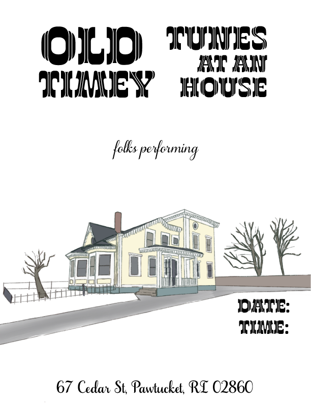

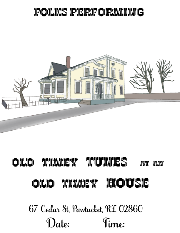

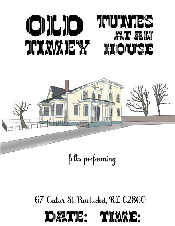

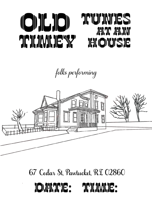
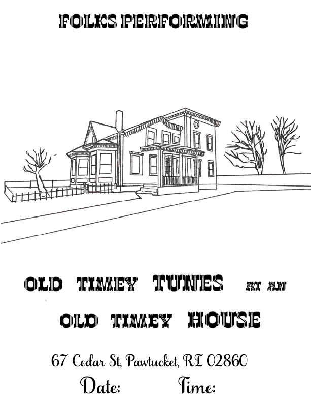
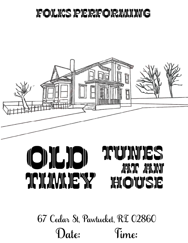

Stage Two:
In this part of the project, I began to understand more of what my client wanted. We were working more off concepts and general ideas, so it was a matter of what stuck most with what I was deciding. I continued to use text hierarchy to see how my header text and body text could properly intersect. I had found a fantastic typeface to title the posters, but I had difficulty finding a type that would complement it well. During this stage, we also discussed whether or not it would be too crowded if we attempted adding in more simplified figures that would be playing instruments.


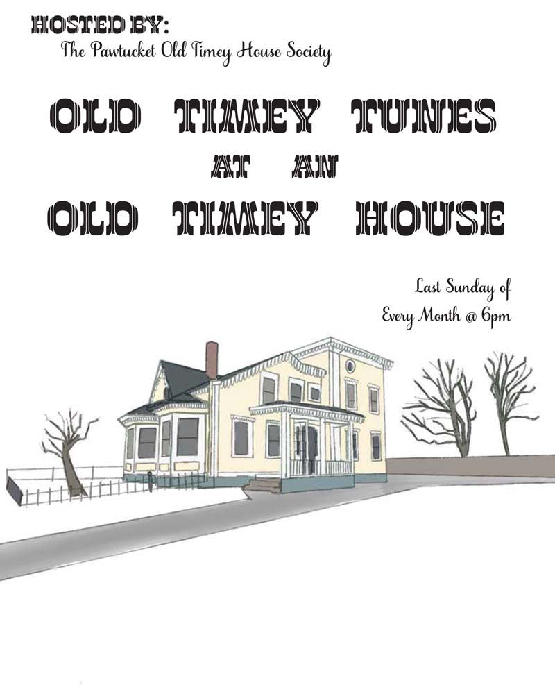

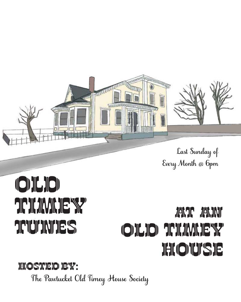
Stage Three:
This stage more experimented with the simplified figures playing instruments. My client and I decided that it would be a little too crowded, but perhaps some of the iterations could be used if used at the right size. The first iteration featured is my personal favorite of the ones with the figures, however I do prefer the ones without. A less crowded poster allows for ease of reading. I also wanted to allow space for the illustration of the house to breath upon the amount of text featured.